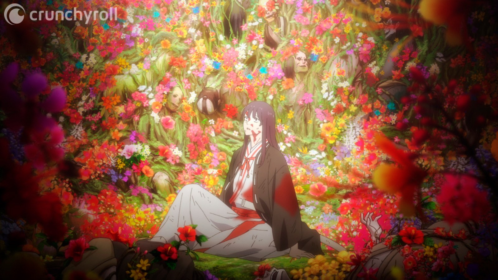
When we read a manga, its art is the first weapon it has to trap us, to hook us in. When I came across Hell’s Paradise on Manga Plus I started to fall in love with it precisely because of the art. There was something in Yuji Kaku's brush strokes that told me I was in for something truly special. Those first watercolor pages, including my first encounter with some disturbing blossoms that seem to be hibiscus sprouting out of a woman's torso, confirmed to me that I was about to embark on a story with some god-tier artwork.
We’re supposed to be talking about the artwork in the anime. But can you really talk about it without dedicating some time, if not most of it, to the manga itself? Therefore, forgive me, but I need to sing the praises of Kaku first and foremost.
Blending Battles with Horror
Like I said at the start, the art of Hell's Paradise: Jigokuraku, as the manga is also known, is one of the most distinctive and captivating elements of the series. It is a stunning blend of bold linework, delicate shading and intricate details, something that shines through from both the beautiful scenery and the frankly disturbing creatures we encounter on the island most of the story takes place in.
Yuji Kaku was no stranger to the bizarre and unsettling, having worked as an assistant for a certain artist you might know called Tatsuki Fujimoto. He most certainly took advantage of his previous experience in his first serialization on Jump Square with Fantasm to improve his art.
Using densely hatched lines with very prominent shading, Kaku manages to toe the line between battle and horror manga. His detailed art style shines through by giving us easily identifiable characters but also some really eldritch abomination creatures that would be right at home in Junji Ito's toolbox. This mixture gives his work a certain charm that distinguishes it from similar works.
RELATED: 5 Things To Know About Hell's Paradise
Kaku knows how to take full advantage of the medium of manga and its characteristic black and white artwork. As a story with darker undertones, the black ink permeates the pages, in some cases gushing out as the blood from the bodies Gabimaru mangles using his hands, feet or even teeth. This is also very evident in his visual metaphors, like whenever he shows Sagiri being constrained by the dark souls of the criminals she has decapitated in the past.
Another impressive aspect of Kaku's art is his attention to detail. Each panel shows his craftsmanship, and even though his major strength is in his character designs and their expressions (not to mention the plasticity of their movements in combat), you can also notice how dedicated he is to getting the details right in all the real flowers we can see on the island, like the hibiscus look-alikes, the lotuses and many more. You’ll see this in the world itself, a mysterious island filled with danger and wonder. The lush forest and the barren wasteland, both are beautiful, despite the horrors they harbor.
This creates the sensation that we’re dealing with a fully realized and lived in world, and while this is certainly a very manga style, it does have a sort of realism we can appreciate in the creases of the fabric of characters outfits, single strands of hair moving and the wrinkles on characters faces when they change expressions.
The shading in the series is quite professional, as expected. Kaku expertly uses hatching and cross-hatching techniques to create smooth gradients of tone and texture. This gives the pages a sense of depth, making everything feel quite tridimensional, which helps create an atmosphere of danger lurking in the shadows.
The artist's talent also shines in his use of negative space, the empty space around and between the subject of any particular drawing. In many panels we can see how he leaves blank space, which gives us a sense of emptiness that adds to the haunting feeling of the series. This is a technique that is best employed in the fights, focusing the reader's attention on the fight and their protagonists and nothing else, highlighting the motion of the combat itself.
RELATED: Why Shonen Jump's Dark Trio is Anime's New Big 3
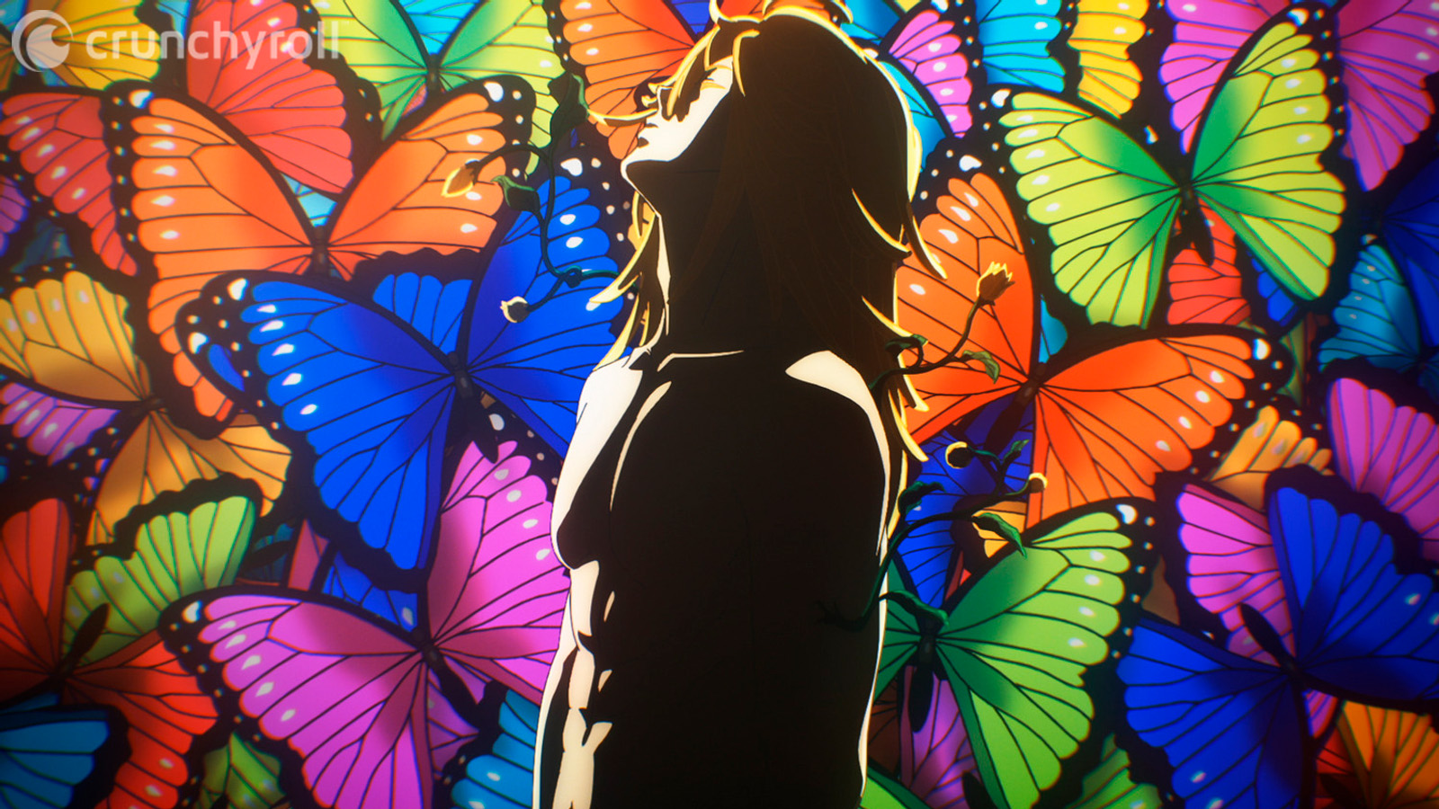
Since I already mentioned how good his character designs are, let's harken back to Kaku’s knack for drafting some truly horrible monsters. Can we talk about those butterflies with deformed human faces? You know what, let’s not, I don’t want to have nightmares tonight. And what about those centipedes with fingers crawling out of their maws? These are only the tip of the iceberg of Kaku’s imagination for creating truly abominable creatures.
Finally, Kaku's use of panel layout and composition is top notch. He knows how to use them to control the pace of the story and to help us follow the action. I would assume the manga itself made it easier for the anime production team to draft their storyboards and choose their shot composition, seeing how Kaku created each page with care and consideration for the readers.
With all this ranting of mine, it should be evident that Kaku’s art is truly deserving of being called God-Tier. But what about the anime? How did they manage to transition from one medium to the other?
Mappa Delivered, Once Again
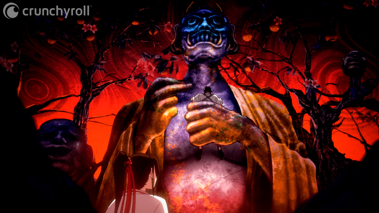
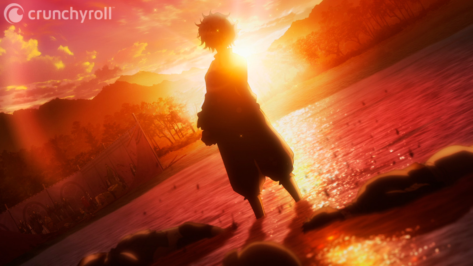
The move from the black and white of the manga to colorful anime should detract a little bit from the whole horror atmosphere. The color palette of the anime is not dark enough to completely preserve Kaku's artistic vibe. But it does help to fulfill the other promise of the title of the work. The island is a hellish paradise, and a paradise must be colorful and vibrant. We can contrast those colors with the ugliness of death and corruption to reach pretty much the same result the original author gave us. No wonder, considering the amount of talent on display from Mappa’s team.
Akitsugu Hisagi debuted as a full character designer and chief animation director on this anime, making full use of his previous experiences as an animator and storyboard artist on some heavy hitters like FLCL, Ghost in the Shell: Stand Alone Complex 2nd GIG, Baccano!, Zankyou no Terror, Yuri!!! on Ice, One Punch Man or Attack on Titan Final Season.
His take on the characters' designs preserve their essence while simplifying them just enough to make the work of the animators easier. It’s cleaner and less shadow intensive but very effective. The job was spectacular in regard to the Lord Tensen, making them seem ethereal, as they should be.
RELATED: Hell's Paradise Anime: Where to Watch, Official Trailers & More
Pretty much the same can be said of Daisuke Niitsuma's rendition of Kaku's creature designs. He rose to the challenge of replicating their nightmarish looks. Also an experienced animator, Niitsuma has the right kind of credits under his belt, having worked on horror titles like Ayakashi - Samurai Horror Tales, Aoi Bungaku, Hellsing Ultimate or Blade of the Immortal and a very long list of other titles in different genres.
The color design also has a talented artist in charge in Ayako Suenaga, who chose a color palette that, while maybe a little bit too vibrant, does the trick of transporting us to a paradisiac environment full of monstrous life. Suenaga does have a flair for the dramatic use of color, so we can expect even better things down the line, considering what we have seen from her before on titles like Kakegurui Twin, Takt Op. Destiny or Attack on Titan Final Season, just to name a few.
All in all, the artistic department of Mappa has proven time and time again that they know their stuff. From the backgrounds to the characters, the artwork is solid in Hell’s Paradise.
There’s no denying that this anime is one of the better looking ones of the spring 2023 season. I can't be more thankful about it, so let's enjoy it together.
Now it’s your turn. Do you like the art of Hell’s Paradise? Let me know what you think about it in the comments below!
Watch Hell's Paradise on Crunchyroll

Amílcar Trejo Mosquera is a writer for Crunchyroll News. He also writes for O'kuroku Webzine (in spanish, sorry) and you can find him on Twitch, Twitter or Instagram.
Source: Latest in Anime News by Crunchyroll!
Comments
Post a Comment